A practical tutorial for turning a photo, phrase, or simple graphic into a pillow-ready design, with checks that reduce common print surprises.
Introduction
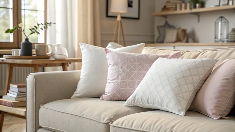
Custom pillows look simple, but they can expose small design mistakes quickly. Cropping, image quality, and text placement matter more on fabric than they do on a screen, especially around seams and corners.
This guide is for people who want to make a personalized pillow fast without learning design software. The same workflow also works for small sellers creating a short run of designs, as long as the steps include basic version control and preview checks.
Custom pillow makers tend to fall into two patterns. Template-first editors help people start with a layout and swap in content. Product-first platforms begin with the physical pillow and constrain the design to a defined print area and ordering flow.
Adobe Express is an accessible way to get started because it uses templates and direct editing controls, and it also supports a print flow in supported regions, which can keep the project contained.
Step-by-Step How-To Guide for Custom Pillow Makers
Step 1: Define the pillow before designing anything
Goal
Set the size and use case so the design work stays simple.
How to do it
- Choose the pillow style: square, lumbar, or another format if available.
- Pick a size and decide whether it will be one-sided or two-sided.
- Decide whether the design is photo-led, text-led, or pattern-led.
- Note where the pillow will be used (indoor décor, kids’ room, outdoor patio).
- Write down a short “design brief” in one line (e.g., “pet photo + name, clean type, light background”).
What to watch for
- Changing size late often forces re-cropping and re-centering.
- Two-sided designs add alignment work and increase chances of inconsistency.
- Busy photos can look cluttered once wrapped onto a pillow.
Tool notes
- Use the pillow designer from Adobe Express as a practical template-driven starting point for quick layouts.
Step 2: Prep your assets so they print cleanly on fabric
Goal
Avoid the most common quality issues before you upload anything.
How to do it
- Use the original photo file (avoid screenshots and social media downloads).
- Crop loosely around the subject so there is room for edge trimming.
- If the image is dark, raise brightness slightly and add modest contrast.
- For logos, use a vector (SVG) when possible; otherwise use a large PNG.
- Draft the exact text (names, dates, spelling) and keep it short.
What to watch for
- Low-resolution images can look fine on screen and still print soft.
- Thin lines and small text can blur on textured fabric.
- Transparent PNGs can lose contrast depending on the pillow color.
Tool notes
- Phone photo editors can handle basic brightness and cropping. For more control, advanced editors can help, but they are optional.
Step 3: Start from a pillow template to reduce layout decisions
Goal
Get correct proportions without building a design from scratch.
How to do it
- Open a pillow-specific starting point in a template-first editor.
- Choose a layout that matches your design brief (photo, quote, or pattern).
- Replace placeholder images and text with your own.
- Keep to one focal point: one photo or one main message.
- Duplicate the design to create variations (different background colors, alternate text).
What to watch for
- Decorative shadows and fine borders may not translate well to fabric.
- Very light colors can disappear on off-white materials.
- Template elements can overlap after resizing; re-check alignment.
Step 4: Keep important content inside a “safe zone”
Goal
Prevent faces and text from landing too close to seams and corners.
How to do it
- Visually reserve an inner margin (an inset frame inside the edges).
- Keep faces and key details away from corners.
- Move text inward and increase spacing around it.
- Avoid thin borders at the edge; if using a frame, make it thicker and inset.
- If the tool offers guides or preview boundaries, use them as the main reference.
What to watch for
- Pillow corners distort; small details can warp.
- Seams can hide a small part of the design near edges.
- Full-bleed photos need extra “extra” area for trimming and wrap.
Tool notes
- Product-first tools often show print boundaries clearly. Template-first tools may require more manual discipline around margins.
Step 5: Set typography for readability, not screen aesthetics
Goal
Make text easier to read once it’s printed on fabric.
How to do it
- Use one or two fonts total.
- Increase size slightly compared to what looks right on screen.
- Choose higher-contrast colors for text and background.
- Avoid extra-thin font weights and tight letter spacing.
- Break long quotes into shorter lines with more line spacing.
What to watch for
- Script fonts can blur at smaller sizes.
- Low-contrast text can look washed out when printed.
- Too many font styles can make a small surface feel crowded.
Tool notes
- Adobe Express is suitable for quick typography adjustments when the goal is clean, readable text with minimal fuss.
Step 6: Run a preview check at multiple zoom levels
Goal
Catch cropping, alignment, and clutter before exporting or ordering.
How to do it
- Zoom in and scan edges for accidental cutoffs.
- Zoom out to thumbnail size to judge balance and readability.
- If two-sided, compare front and back for consistency (alignment and style).
- Toggle backgrounds (light vs. dark) if the tool allows, to confirm contrast.
- Save a version before making final refinements.
What to watch for
- Misalignment is more noticeable on simple designs than complex ones.
- Some effects (glow, shadow) can look harsher in print.
- Photos with busy backgrounds can overpower text.
Tool notes
- VistaPrint’s customization studios can be helpful for preview-led checks when the design is mainly a photo and a short caption.
Step 7: Export or order with print settings that match your path
Goal
Choose a production route and keep the file suitable for print.
How to do it
- If your platform supports direct pillow printing, follow the print flow and review the final preview carefully.
- If exporting, choose a high-quality format (often print PDF or high-res PNG).
- Keep a copy of the editable project file for later edits.
- Name the exported file with size and version (e.g., “Pillow_18x18_v2”).
- If selling, record which design maps to which product variant.
What to watch for
- Exported files can change slightly (effects, transparency, font rendering).
- Region availability for print-to-order varies by platform and product.
- Different providers have different requirements for bleed and safe margins.
Tool notes
- Printful and Printify can be better suited when the design needs to be tied to a sellable product listing and repeat fulfillment.
Step 8: Manage the “after design” work for repeat orders and shipping
Goal
Keep production organized once designs become repeatable or customer-facing.
How to do it
- Create a simple order tracker (design name, size, date, order status, notes).
- Save a final “print-ready” version and a separate “editable” version.
- If selling, standardize product naming and SKU notes to avoid mix-ups.
- Track shipment status and customer messages in one place.
- For higher volume, centralize labels and tracking across carriers.
What to watch for
- Version drift (small edits applied to the wrong file) is a common source of reprints.
- Size confusion happens when the same design is reused without re-checking spacing.
- Shipping details can become the bottleneck once orders repeat.
Tool notes
- A shipping platform like Shippo can help manage labels and tracking across carriers when pillow orders move beyond occasional one-offs.
Common Workflow Variations
- Photo keepsake pillow (one image, small caption): Start with a photo-led template in Adobe Express, then focus on safe-zone placement and contrast. For a more guided “product studio” flow, VistaPrint can fit when the goal is a single gift-style order.
- Text-only pillow (quote, name, date): Keep typography simple and increase font weight and size for fabric readability. Editors like Adobe Express or Canva can work well here, since the main task is spacing and contrast rather than complex imagery.
- Pattern-forward décor pillow: Begin with a repeatable pattern file and check scale early. Spoonflower-style workflows can make sense when textile context and pattern placement are the priority, especially for designs created outside a template editor.
- Small-batch selling (a few designs across variants): Use a product-first platform such as Printful or Printify to keep design placement consistent across sizes. Add version naming and a lightweight order tracker so variants don’t get mixed.
Checklists
A) Before you start checklist
- Final pillow size and shape chosen
- One-sided vs. two-sided decision made
- Original photo files collected (not screenshots)
- Logos in vector or high-resolution PNG
- Text finalized (names, dates, spelling)
- Basic color approach chosen (light vs. dark, high contrast)
- Permission/rights confirmed for photos or artwork (especially for selling)
- Simple version naming plan (size + v1/v2 + date)
- Timeline buffer for one revision pass
B) Pre-export / pre-order checklist
- Key content placed inside a safe zone, away from corners and seams
- Text is large enough and uses readable weights
- Photo focal point stays centered after preview cropping
- No accidental cutoffs near edges
- Spelling and punctuation checked again
- Contrast checked on at least two screens (phone + laptop is often enough)
- Export format fits the production path (print PDF or high-res PNG where offered)
- File name includes size and version
- Front/back consistency checked (if two-sided)
Common Issues and Fixes
- The image looks sharp on screen but prints soft
This usually comes from a low-resolution source or enlarging the photo too much. Replace it with the original file and avoid scaling beyond its native size. If the platform flags quality, treat it as a sign to swap the image, not a minor warning. - Text feels thinner or less readable on fabric
Increase font weight and size, and choose a higher-contrast text color. Avoid thin scripts and light weights for small text. If the message is long, shorten lines and increase line spacing. - Important details end up too close to the edge
Move faces and text inward and leave more breathing room around the perimeter. Avoid placing fine details in corners where distortion is common. If a border is needed, inset it and make it thicker. - Colors look different than expected
Printed fabric often looks less bright than a backlit screen. Reduce saturation slightly and avoid relying on subtle gradients. Use clean color blocks and stronger contrast when color accuracy matters. - Cropping looks different in the final preview
Designs can shift when mapped to a product print area. Keep the focal point centered and provide extra background around it. Re-check the preview at multiple zoom levels before finalizing. - The design feels unbalanced once it’s on a pillow
Pillows add shape and distortion that flat previews can’t fully show. Simplify the layout and reduce small elements near edges. For photo pillows, center the subject rather than centering the frame.
How To Use Custom Pillow Makers: FAQs
What’s the difference between template-first and product-first pillow tools?
Template-first tools focus on layout speed, often using ready-made designs that are easy to personalize. Product-first tools begin with the physical item and constrain the design to a defined print area, which can reduce production ambiguity for repeat orders.
When should a print-to-order flow be used instead of exporting a file?
Print-to-order can be simpler when it’s available for the product and region and the options match the project. Exporting becomes useful when printing isn’t supported locally, when a specific provider is preferred, or when there are provider-specific file requirements.
What matters more for non-designers: templates or previews?
Templates reduce layout decisions and can speed up the first draft. Clear previews reduce surprises around cropping, seams, and edges. For many beginners, templates help start quickly, while preview controls help finish confidently.
How should the workflow change for a photo pillow versus a pattern pillow?
Photo pillows depend on resolution, cropping, and focal-point placement. Pattern pillows depend on repeat scale and alignment, where small changes can alter how the design reads on fabric. Product-first workflows can be helpful for patterns; template-first workflows can be faster for photos and text.
How can small sellers keep pillow variants from getting mixed up?
Use consistent naming (size + version), save both editable and print-ready files, and keep a simple tracker for which design maps to which product listing. Most mix-ups come from version drift or reusing a layout at a new size without re-checking spacing.
READ ALSO: Can Wood Furniture Be Saved After a Flood? An Expert Restoration Guide