A technical tutorial can be correct in its written steps and still fail because the visuals do not show the moments readers actually need to verify. A decorative laptop image adds atmosphere, but it cannot confirm which menu to open, what output should appear, or how an error differs from a successful result. The opposite problem is just as serious: a polished mock interface may look like evidence even when it was never captured from the software being explained.
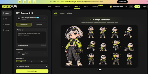
Useful tutorial visuals therefore need different jobs. Screenshots and terminal captures can document what happened during a real process, while diagrams and illustrations can explain relationships that are difficult to see on screen. The challenge is deciding which type belongs at each point and preventing an illustrative image from being mistaken for proof. When a concept needs a supporting visual rather than a factual screenshot, ChatGPT Images 2.5 API can be explored as one route for generating or refining an illustration from a text brief or reference. The rest of the workflow should still begin with evidence, reader questions, and a clear boundary between what was observed and what was created.
Separate Evidence From Illustration Before Designing
Before making any image, label the information it is supposed to carry. Evidence shows the actual state of a tool, device, file, or process. Illustration helps a reader understand an idea, sequence, comparison, or visual metaphor. Mixing the two roles creates ambiguity.
For example, a guide about enabling a browser setting should use a real capture for the menu location and resulting state. A simple diagram may then explain how that setting changes the flow between the browser, a website, and a local permission. The diagram can simplify the relationship because it is not claiming to reproduce the interface.
A quick test is to ask, “Would a reader use this image to verify that they are on the correct screen?” If the answer is yes, use material captured from the real process and keep relevant labels, version details, or visible states intact. If the answer is no, an illustration may be more readable and useful.
Build Visuals Around Reader Decision Points
Do not add an image after every paragraph simply to make the page look richer. Add one where the reader must recognise a state, choose between paths, or understand something the text alone makes unnecessarily abstract.
1. Capture the Step That Can Fail
Look through the workflow and find the first point where a reader could reasonably end up somewhere different from you. It may be a permissions prompt, a command result, a settings panel, or a file created after an export. Capture that moment rather than a generic opening screen.
Include enough surrounding interface to provide orientation. Cropping too tightly around one button can hide which panel or tab contains it. Remove unrelated private information, notifications, account details, or filenames that do not help with the step.
2. Show the Expected Result Honestly
A tutorial should show what success looks like, especially when the result is not obvious. If a command should return three lines, capture those lines. If a setting changes an icon or status label, show the changed state. This gives readers a checkpoint before they move on.
Do not clean up details that affect reproducibility. If the real output includes a warning that does not block the task, explain it. If the interface differs by version, identify the version used rather than presenting one screen as universal.
3. Use Illustrations for Concepts, Not Proof
Some subjects are better explained through a constructed visual. A network request moving through several services, a backup sequence, or the relationship between a local app and cloud storage may be clearer in a diagram than in several screenshots.
Keep these visuals visibly explanatory. Use simplified shapes, labels, arrows, or an editorial style rather than a fake application window that could be confused with a genuine interface. The image should reduce cognitive load without inventing a factual state that readers might try to reproduce.
4. Check the Visual in Context
Place the image beside the paragraph or step it supports and read the section as a first-time visitor. The caption, image, and surrounding text should all point to the same action or idea. If the visual requires a long explanation of why it is there, it may be solving the wrong problem.
Also view it at the approximate width of the published article. Interface text that is readable in an editor may be useless on a phone. Crop with context, use a second close-up, or annotate the real screenshot without changing its meaning.
Use Generated Images for Supporting Explanations
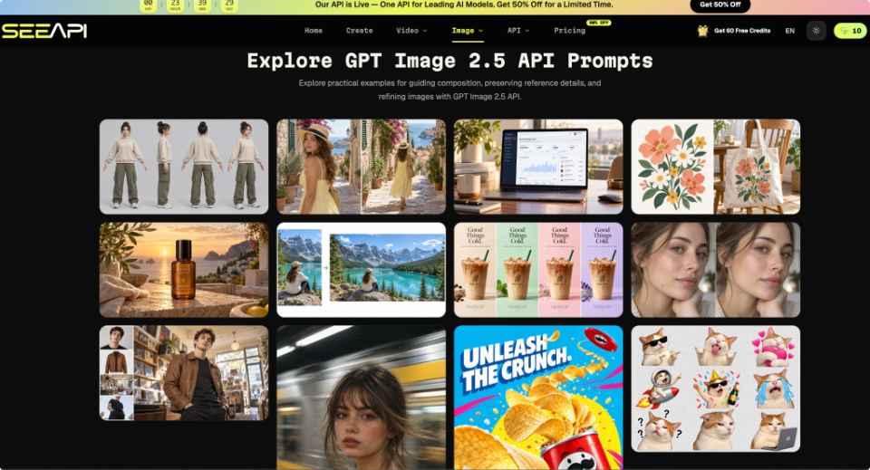
Generated imagery is most useful when the article needs a concept visual, header illustration, or explanatory scene that does not pretend to document actual software behaviour. Start by defining the message the image should communicate and which parts are illustrative. That boundary prevents visual polish from becoming accidental evidence.
For a supporting illustration, ChatGPT Image 2.5 can be used with a short text brief or reference image. Specify the subject, the intended composition, and one or two elements that must remain consistent; the system can generate a new visual or edit the reference. After generation, check whether any visible interface, label, device detail, or text could be mistaken for a factual claim. Replace or revise anything that implies a real product state you did not verify.
Consider a tutorial explaining how automated backups move files from a laptop to remote storage. A generated editorial image could show a laptop, a storage symbol, and a directional flow to establish the concept. It should not show a fabricated settings panel with believable buttons, account names, or completion messages. Those details belong in verified screenshots if the article needs them.
Review Every Visual for False Signals
The final review should focus on interpretation rather than beauty. Ask what a reader might reasonably believe after seeing the image without the full article. If it looks like a screenshot, they may assume the interface exists exactly as shown. A security badge may be read as a certification claim, while realistic device details can imply hardware facts you never intended to assert.
Use a simple pass-or-revise check. A visual passes when its source role is obvious, the important detail is readable at publishing size, and it supports the neighbouring instruction without adding unverified information. It needs revision when decorative elements resemble evidence, generated text looks authoritative, or the image conflicts with the step it is meant to explain.
Technical accuracy also includes sequence. An authentic screenshot placed beside the wrong step can mislead as easily as an invented one. Compare the final article against the actual workflow from beginning to end and confirm that each screenshot appears after the action that produces it, not before. For longer guides, keep original captures in a separate folder so later edits do not replace verified material with a visually similar mock-up.
Make Visual Accuracy Part of Publishing
A useful technical article does not need an image for every instruction. It needs the right visual at the points where readers must verify progress, understand a hidden relationship, or recover from uncertainty. Capture real interfaces when the image functions as evidence. Use diagrams and illustrations when simplification makes an idea easier to understand. Keep both roles visually distinct, and review every asset at the size and position where readers will actually encounter it.
This approach also makes future updates easier. When a software interface changes, you can identify which evidence screenshots require replacement without rebuilding every conceptual illustration. When the underlying explanation stays the same, diagrams can often remain useful. Treating visuals as structured parts of the tutorial rather than decoration creates a cleaner maintenance process and a more reliable reading experience. The result is a guide in which readers can tell what actually happened, what they should expect to see, and which images exist simply to help them understand the idea.